


Web 3asy
A route tracking service app for public transit users
Overview of Project
Summary

The public transit authority increased the number of bus routes to meet the demand of its growing city. They soon discovered this also created a lot of confusion.
The city has called upon a development team to design a product that clearly informs users of the routes, and arrival times of all the buses.
Roles and Responsibilities
Jenna Jacobs
UX/UI Designer
Timeframe
4 Weeks
Deliverables
Competitive Analysis
Personas
Journey Map
User Stories
User Flows
Site Map
Wire Frames
Style Guide
High Fidelity Prototype

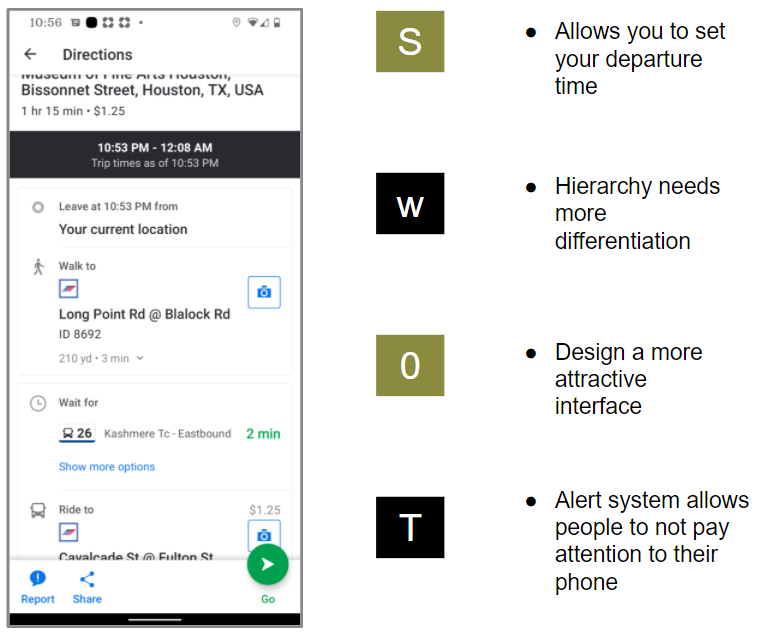
The Problem
Due to the increase in routes that service the same stops users are not sure what bus is arriving. Out of worry, they run to catch a bus, only to realize its not theirs.
Washington & State stop is serviced by 7 bus routes which creates the most confusion.

Target Audience
Adults ages 18-35
Urban dwellers & surban commuters
Day job workers, students
Daily interabled users & tourists

The Solution
A GPS tracking service that allows users to see real-time arrivals for all buses that service a stop.
Process
Quantitative Research
This survey determined how people are currently using the public transit system, patterns in behavior, and pain points at the forefront of the user’s mind.
-
91%
Use an app to plan their transit.
-
71%
Use Google maps.
-
16%
Use their local public transportation commission app.
Greatest pain-points of public transit
Reasons for app choice
Qualitative Research
I interviewed users to discover their thought processes behind their transit planning and why they used public transit the way they do.

Katy uses a combination of BART, the train route in San Francisco, and the bus. She chooses to do BART in the morning because it's faster and it allows her to maximize sleep time. On the way home, she takes the bus because arriving on time isn't an issue. Also, although the bus is a little pricier it feels safer because it is less crowded. There is also more seating. So, in the evening she opts for a more comfortable ride.
Competitive Analysis
I reviewed competitors to identify how these apps are differentiating themselves from each other. These apps are presenting the same information with different structure. The interface for task is a different experience in each application.
The following graphics highlight the greatest strengths, weaknesses, opportunities, and threats of our competitors. These criteria are given the acronym SWOT.
Moovit
Transit
Personas


Journey Map

Information Architecture
User Stories
The high-priority user stories are determined by the business requirements given by the city of Chicago. They are aimed towards finding arrival times for different routes.

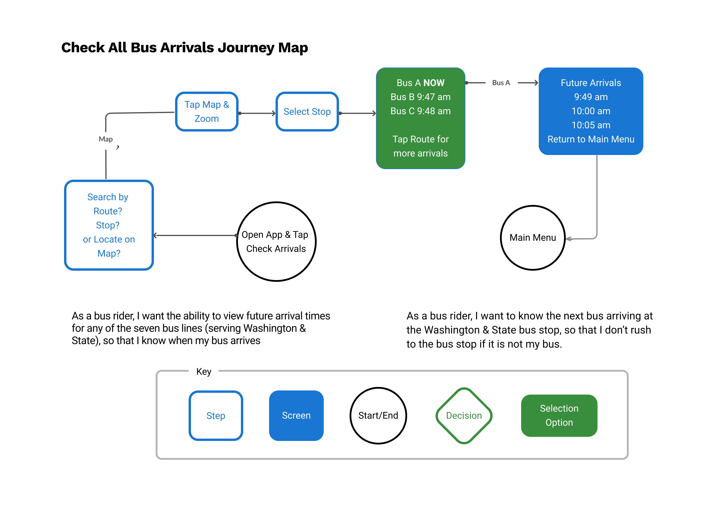
User Flows
The following two flows are designed to allow the user to find arrival times. The first allows the user to zoom on the map and select a stop. The second flow works like a catalog where the user can search by the route and stop.

Site Map

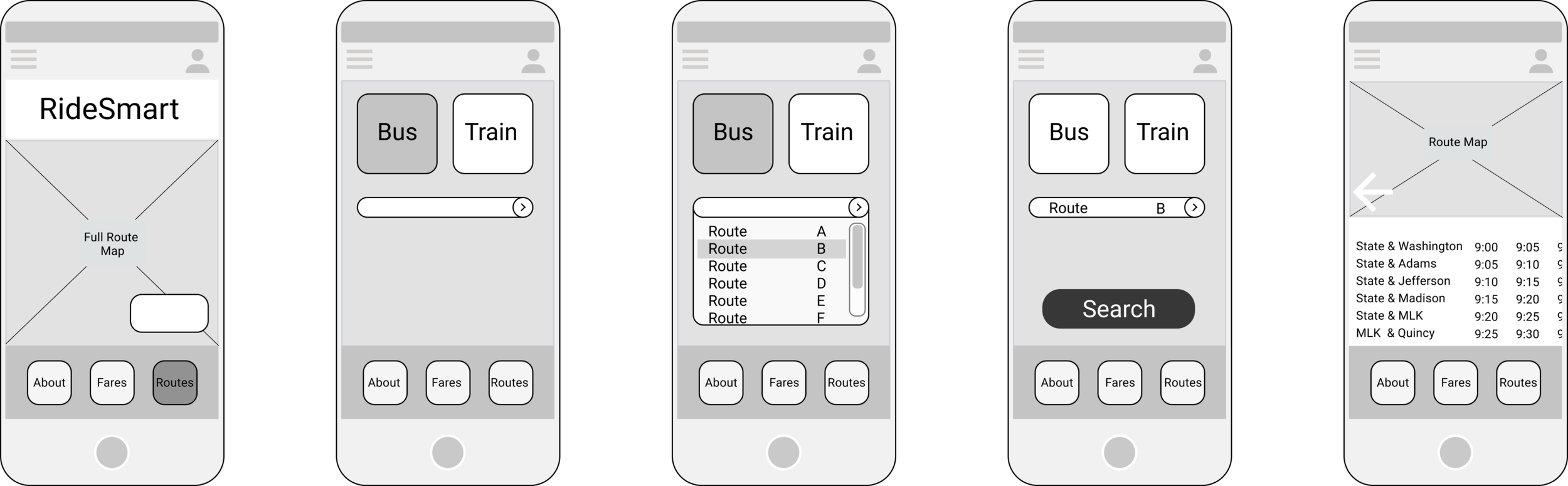
Wire Frames
What options would Brandon need to speed up his process at this point? I created the floating task to post jobs for quicker access. I thought about how he would consider candidates in both an urgent and a timely circumstance.
“Hire now” allows the user to bypass the interviewing process and hire their first choice.


Digital Wireframes

First Iteration Test
The purpose of this test is to test the effectiveness of an app for the following tasks.
Look up what bus is arriving next to a given stop
Find out when any bus servicing this stop will be arriving
Look up future arrival times for a given route to this stop
Next Steps
Problem
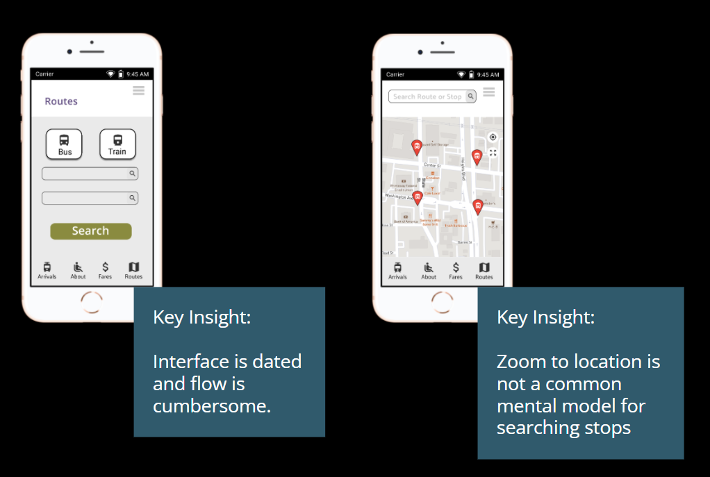
The interface is dated and there are too many steps to arrive at the needed information.
The map, as it is designed now, is not intuitive.
Recommendation
Redesign interface to hide currently unused functions.
Allow GPS and map to be the focus for the layout.
Branding Development
For branding, I considered the emotions a user would be feeling when preparing for a trip. From my research, I knew that buses often run late and that can disrupt otherwise smooth plans. Blue-greens and violet were chosen with the goal of calming the user. The strong saturation of these colors keeps them assertive leaving the user still feeling empowered and trusting of the app.
Style Tile


Name & Logo
Since this app serves the primary need of tracking public transit. For that reason, I wanted to create a name that spoke to that function. As much as I like Ridesmart, it could reference any kind of transportation. I also considered “stickiness” or how easy the name is to remember. So I also played on pop artists and songs.


User Interface and Usability Changes
Before

The highest impact change here is that you can see the routes while seeing the map. The new information architecture takes into account the direction of the route.
After
The upcoming routes for a stop are listed in a pull-up menu in reverse chronological order. Time remaining until arrival is on the right side and updates in real-time. The color coding identifies the route type (express, local, regional, etc).

Second Iteration

Although the solution fulfills the business requirements at this point. The task flow does feel satisfying for the users.

Last Step
A final screen was added where the user can see their bus enroute with a list of all the stops it will make in a timeline below.

Learnings
-
The UX designer has got to get their hands dirty. No amount of comparing different navigation apps will replace the insight given from actually riding a bus. It may sound obvious, but even riding a couple of times isn’t the same as living with a service. The pain points are deeper and shape the user’s overall behavior, thought process, and eventually their attitudes and sensibilities.
In the few times I rode, I realized I would have to always check the weather, have money loaded to my Google wallet and wear shoes I can outside in.
Furthermore, had I ridden the bus regularly, I would have known that “zoom to map” would not be an established mental model.
On the contrary, designers are trained to not allow their own biases to influence the decisions made in their work. I can attest that without personal experience, the designer has a large blindspot. Moving forward I will consider how I will allow my own familiarity to affect my design to create the most informed design while minimizing personal bias.

Conclusion
The citizens of Chicago now have a real-time tracker for route arrivals and they are happier with their public transit experience.
Users are able to:
See when each bus arrives at Washington & State.
Tell them how much time they have before their bus arrives.
See arrival times for any of the 7 buses that service Washington & State.
The major question for designing this solution was determining how to present a lot of similar information in a manner where the most important is in the foreground.
The ability to search a stop and then immediately see all buses en route for that stop allows users to then select the relevant one for themselves.